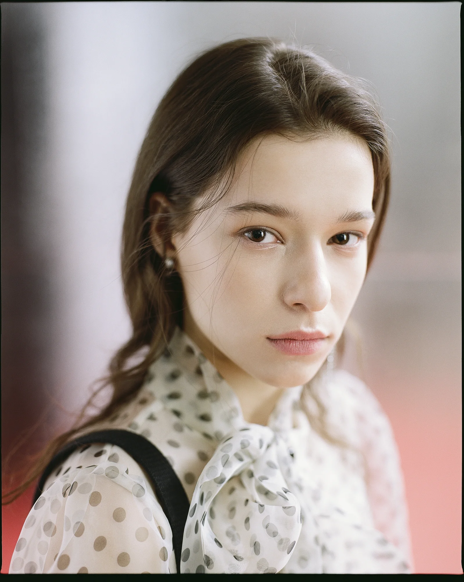
One of the benefits of black & white photos is you can push the contrast of your image further than a colour could handle. When contrast is added in a colour image, the more you add the more saturation you need to deal with, which affects the harmony of the colour grading you’ve made thus far.
Here’s the recent shot from a small session I arranged in my studio with Alay Bowker (model) & Amy (stylist).
I used a graduation map in photoshop to make the shadow area more black and pronounced. I also added a bit of green in the highlights with a touch of magenta in the shadows for subtle visual interest (even though it’s still technically a black & white image)


